Helps you to see the big picture
Creating a Google Docs Gantt chart can be a useful project management tool. Gantt charts can help you establish visual context for your project’s timeline and progress. You can use other programs for creating Gantt charts as well, but they can be complex, especially for something like a client review.
You can also create a Gantt chart in Excel, but a Google Docs Gantt chart is readily accessible over the cloud. You can allow authorized members edit access so they can collaborate on a Google Doc without having to send the spreadsheet back and forth via email.
Create a Google Docs Gantt Chart
Before you get started with creating a Google Docs Gantt chart, you need to populate the Google worksheet with some data.
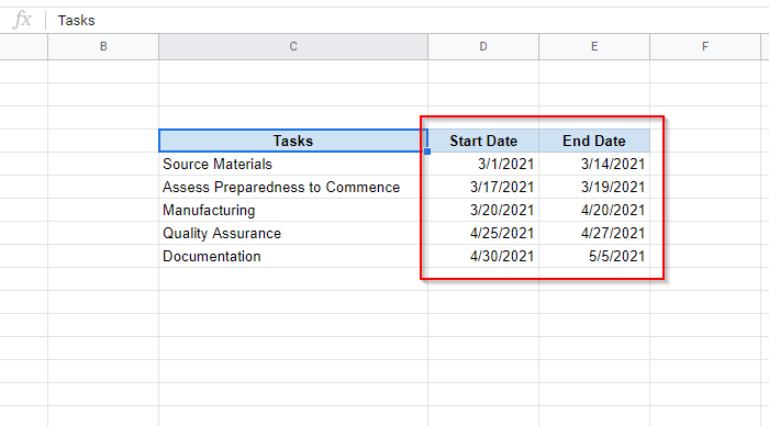
- Set up your tasks in a Google sheet so you have your project’s schedule in table form. List out the tasks of the project and assign a start and end date to each task.
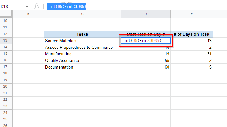
- Your next step is to set up another table where you’ll list the day on which a certain task will begin and the number of days it will take to complete. For instance, the first task “Source Materials” starts on day 0 and goes on for 13 days.
Here’s how you can prepare each column:
- Tasks: Just copy this column from the previous table.
- Start Task on Day #: Here, you’ll want the nth day in your project’s timeline when a particular task is supposed to begin. So, you’ll essentially need to compute:
[A Task’s Start Date – The First Task’s Start Date]
In this example, the following formula should be entered in the relevant cell:
=int(D5)-int($D$5)
Once you’ve entered the formula, you can apply the formula to the remaining cells by dragging the border selection. The dollar sign in the formula helps you preserve a cell reference when you apply the formula to other cells.
The formula calculates the difference between two dates as an integer (that’s what the INT function does). Without the INT function, you may receive an output with a decimal value.
If you see a date in the 1900s after entering this formula, make sure that you’ve formatted the cell as a number and not a date.
- # of Days on Task: Here, you’ll calculate the number of days to be spent on each task as per your project timeline. You can compute this as:
[A Task’s End Date – The First Task’s Start Date] – [The Task’s Start Date – The First Task’s Start Date]
In this example, the formula use to compute the number of days spent on a task is:
=(int(E5)-int($D$5))-(int(D5)-int($D$5))
Be sure to enclose the two subtracting operations in parentheses. Otherwise, you could receive an incorrect output.
When done, drag the border selection to apply formulas to the rest of the cells, just like you did for the previous column. Also, make sure the cells are formatted to display a number and not a date.
- Select the entire table that you just created and select Insert > Chart from the top ribbon.
- You’ll now see a chart on your screen and a Chart editor at the right of your screen. Select Chart type under the Setup tab in Chart editor.
- A list of chart types will appear in the Chart editor. Scroll through and look for the Bar section. From this section, select a Stacked Bar Chart.
- Next, switch to the Customize tab. Expand the Series section and select the Start Task on Day # series. Set Fill Opacity and Line Opacity to 0% to hide it from the chart.
That’s all you need to create a Google Docs Gantt chart. If you want, you can customize it further. You can rename the chart, name the horizontal and vertical axis, and explore other customization options in the Customize tab.
Create a Google Docs Gantt Chart with an Add-On
If you don’t want to spend time manually creating a Google Docs Gantt chart, you can always use one of the several Gantt chart add-ons available for Google Docs.
To download an add-on, select Add-ons from the top ribbon, and select Get add-ons. Search for Gantt chart. Select Slick Gantt > Install. You could just as well select another one, but Slick Gantt is a no-fuss, easy to use tool.
Once you’ve installed the add-on, go back to your Google sheet. There are two caveats you need to take care of before using Slick Gantt.
You’ll first need to reposition your data. If you haven’t already, place the data such that it starts from cell A1, otherwise Slick Gantt will have trouble finding the data in your sheet.
Plus, you’ll also need to add a Task ID column to your data since the add-on requires at least four fields (Task ID, Task Name, Start Date, and End Date).
Once you’ve placed the data appropriately and added a Task ID column:
- Select Add-ons from the top ribbon and select Slick Gantt > Gantt chart.
- The add-on will now load a Gantt chart for you.
- If you want to email the Gantt chart to your team, you can also download it as a picture by clicking on the picture icon at the top.
There are several other add-ons you can use instead of Slick Gantt:
- Gantt Chart by AddonForge is a great tool if you need an add-on with all the bells and whistles. However, a lot of features are restricted to the paid version.
- Gantt Chart Generator by Takuya Tokiwa is another clean and simple add-on, and offers most features you’d want in a Gantt chart tool.
- Awesome Table by Awesome Gapps can do a number of things, and creating Gantt charts is one of them. If you need a tool that does a lot more than just create charts, this is a great tool.
Your Google Docs Gantt Chart Is Ready
Once you’ve set up the chart, you can update it in real-time by updating the data in the sheet. Like how easy this was? You can also try making a scatter plot in Google Sheets, if that’s more relevant to your work.


